The colour of a cake is the first thing people see when the box opens, and it sets the tone for the whole celebration: pastel cream feels gentle, red speaks of love, while navy and black look formal and grown-up. If you are looking for cake colour ideas, start with the occasion and who the cake is for, then choose the lettering colour for contrast: dark letters on light cream, white or gold on dark. Below we go through all 19 cream colours and 12 lettering colours in our online cake builder, suggest ready-made palettes for different occasions and explain how to choose the border colour.
19 cream colours to choose from
In the builder you choose the cream colour straight after the size. To make the palette easier to navigate, we have split it into five groups by the impression the cake makes:
| Group | Cream colours | Impression |
|---|---|---|
| Light neutrals | White, Cream, Grey | a clean base for any lettering or picture |
| Warm pastels | Powder, Pink, Peach, Yellow | soft, gentle and festive |
| Cool pastels | Mint, Pistachio, Sky, Lavender | fresh and calm |
| Rich mid-tones | Raspberry, Coral, Periwinkle, Lilac | brighter than pastels — the lettering needs the darkest shades |
| Dark and bold | Chocolate, Black, Blue, Red | daring, formal or simply striking |
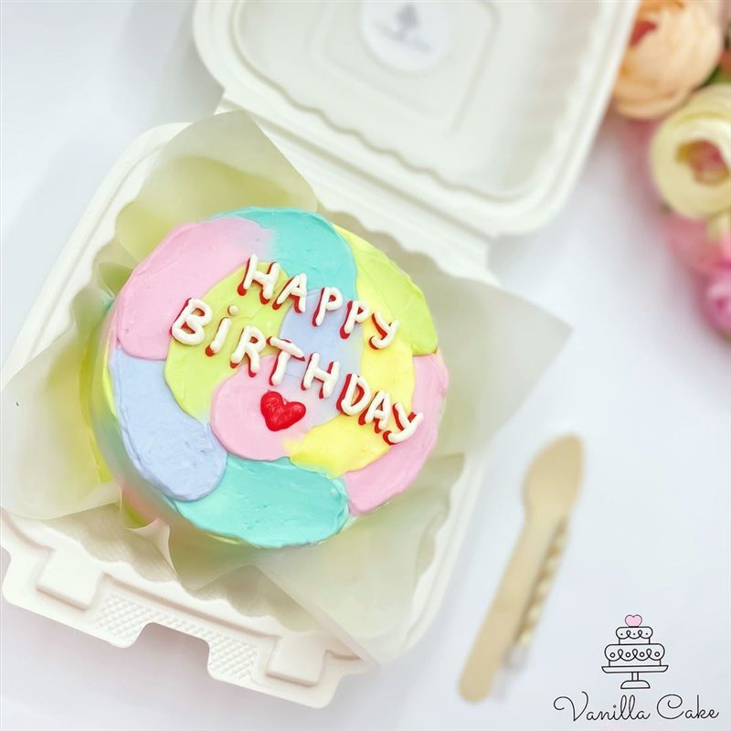
Fifteen of the nineteen shades are light, so lettering and pictures show up well on them, while the four dark colours become the main decoration in their own right. The catalogue also has cakes in colours outside the palette: emerald, dark green, coffee beige, a soft white-to-blue gradient or multicoloured brushstrokes. It is easiest to order a cake like that from its own page in the bento cake catalogue, and we will write your own lettering on it.
12 lettering colours and the rules of contrast
You choose the lettering colour in the same builder. The palette has twelve colours: Pink, Red, Raspberry, Navy, Blue, Green, Chocolate, Black, White, Gold, Silver and Purple. You can add up to three lines of text, and each one can have its own colour: tap a line on the cake and pick a shade — only that line changes. If no line is selected, the new colour is applied to all the lettering at once. Navy is the darkest blue on offer — noticeably darker than the Blue cream.
To keep the lettering readable both up close and in photos, follow five rules:
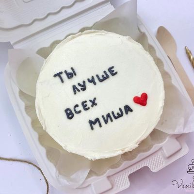
- Dark on light. On White, Cream and the pastels, the most readable lettering colours are Black, Chocolate, Navy, Raspberry and Purple. Red stands out well too, while Pink, Blue and Green look softer — save them for large letters and short words.
- Light on dark. On Chocolate, Black, Blue and Red cream, write in White. Gold and Silver look their best on Black and Chocolate.
- White lettering needs a darker cream. On White and Cream it disappears, and on pastels it is barely visible. A good example is the vivid red cake with “i love you” in white: white letters on a saturated base can be seen from across the room.
- Don’t pick lettering from the cream’s own colour family. Raspberry, Pink or Red lettering on Raspberry cream, or Navy or Blue letters on Blue cream, simply blend in. On the rich mid-tones — Raspberry, Coral, Periwinkle and Lilac — go for the darkest options: Black, Chocolate or Navy.
- Tone on tone only works in relief. White on white looks lovely when the decoration is raised: on one of our white cakes the clouds, stars and lettering are all done in the same tone. If the words have to be read at a glance, you need contrast.
Gold, silver and accents
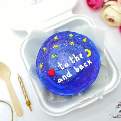
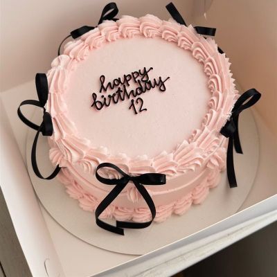
Gold is the most festive lettering colour, but it behaves differently on each base. On light cream it gives a soft shimmer: a cream cake with “love forever” in gold and a red heart stands out without shouting. On a dark base gold comes into its own, like the gold stars and crescent moon on the deep blue galaxy cake. And on the white bow cake with a gold number and matching cream ribbons, that single number carries the whole look — a good choice for a milestone birthday.
Silver is almost invisible on light cream, so it works best as a detail: large daisies and silver beads made one sky-blue cake the dressiest of our spring series. The general rule is two or three colours per cake: the cream, the lettering and one accent, such as a red heart or a gold number. The more colours you add, the harder it is for the eye to find the focal point.
Cake colour ideas by occasion
If you are not sure where to start, take a ready-made palette and change one colour to suit your taste:
| Occasion | Cream | Lettering | Border and accent |
|---|---|---|---|
| For a baby: months, 40 days, first birthday | Powder, Pink, Sky, Mint, Lavender, Yellow | Navy, Chocolate, Raspberry | white pearls |
| Love: Valentine’s Day, anniversary | Red; White or Cream; Powder | White on Red; Red or Raspberry on light cream | red hearts |
| For him | Blue, Black, Chocolate, Grey | White; Gold or Silver on Black and Chocolate; Navy or Black on Grey | white shells |
| Milestone birthday or formal occasion | Black, Chocolate, White, Cream | Gold on dark cream; Black or Chocolate on light | a gold number |
| A gentle gift for her | Powder, Cream, Lavender | Raspberry, Chocolate | a border matching the cream |
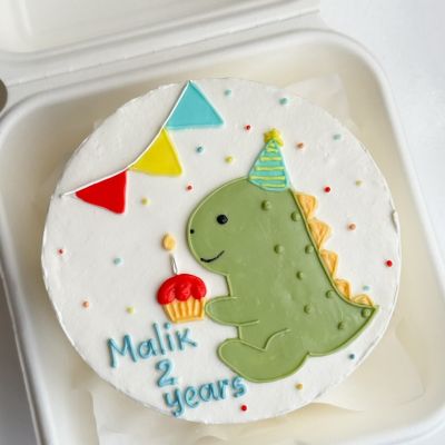
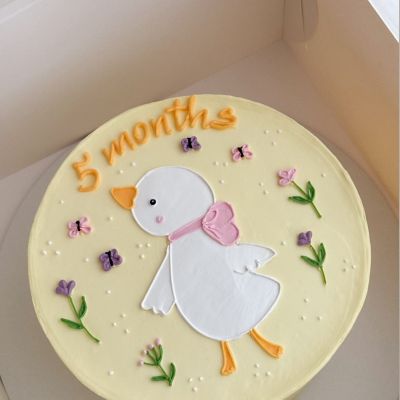
For babies, pastels work well: a gosling in a pink scarf on a pale yellow cake, or a wreath of tiny cream flowers in powder pink with greenery — a soft palette with no bright spots, which looks lovely in family photos. Make the month number dark — Navy or Chocolate — so that it shows up in photos.
For a declaration of love, red and pink are the classics. Red cream with white letters is the boldest choice; a white cake covered in red hearts with pink lettering in the middle is gentler. For a quieter look, keep the cream light and make only the heart red.
For men, darker and calmer colours work well. The most formal palette is navy: the navy set of four mini bentos with white lettering and pearl borders is frequently ordered for men. Black with red looks bolder, as in the high-contrast set with drawings and names, while caramel and beige is the most restrained option — calm colours for a grown-up celebration. You will find themes and lettering ideas in our article on cakes for men.
Border colour
The border is the piped cream trim around the edge of the cake. In the builder this step is called Cake border, and there are three options: No border, Pearls (cream pearls around the top rim) and Shells. On cakes for 3–4 and 7–8 people the shells go both on top and at the base, while on the small cake for 1–2 people the trim is on top only. As soon as you choose Pearls or Shells, a Border colour palette appears with the same 19 shades as the cream. The border is white by default, and there is no extra charge for it.
- Matching the cream — the calm option: the border adds texture while all the attention stays on the lettering and the picture.
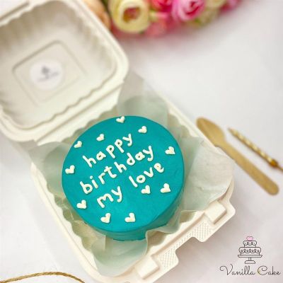
- White on colour — a neat frame: white pearls or shells look smart on Pink, Sky or Blue cream.
- Matching the lettering — ties the design together: for example, chocolate lettering and chocolate shells on a cream-coloured cake.

Here is the white cake with a scalloped cream border and “love you” in fine script: its border can be coloured or left white. The names of the cream, border and lettering colours you choose are added to your WhatsApp order message, together with a link to the design image.
Colour pairings from the catalogue to build on:


Cake colour FAQ
How many cream colours can I choose from?
Can the lines of lettering be different colours?
What lettering colour goes with a white cake?
Does the colour affect the price?
What if the shade I want isn’t in the palette?
The right cake colour isn’t the brightest one but the one that fits the occasion, the person and the message. Choose a palette, check the contrast in the builder, and if you are unsure about a shade, message us — we will make the cake for your date in Baku. Styles and themes that suit these palettes are collected in our article on bento cake design ideas.